Not every event needs a website.
A 12-person investor dinner, a closed-door workshop, a Friday team offsite, those run perfectly well on a calendar invite and a shared doc. Building a microsite for them is overhead nobody asked for, and the kind of thing event teams do out of habit rather than necessity.
The events that earn a dedicated website are the ones doing real work through it. Public registration. Sponsors, speakers, and attendees on different paths. Paid tickets and the invoicing trail that comes with them. Capacity limits and waitlists. Anything where the brand experience is part of the deliverable, which covers most agency client work. Anything with paid media pointing at it, where the registration page is also a landing page being asked to convert traffic.
If your event fits one of those, the website is doing real work. If it does not, save the time.
A quick aside on the AI question
It comes up on every event-tech forum lately: if anyone can vibe-code a registration page in an afternoon, and ChatGPT writes the speaker bios while you make coffee, why pay for an event platform?
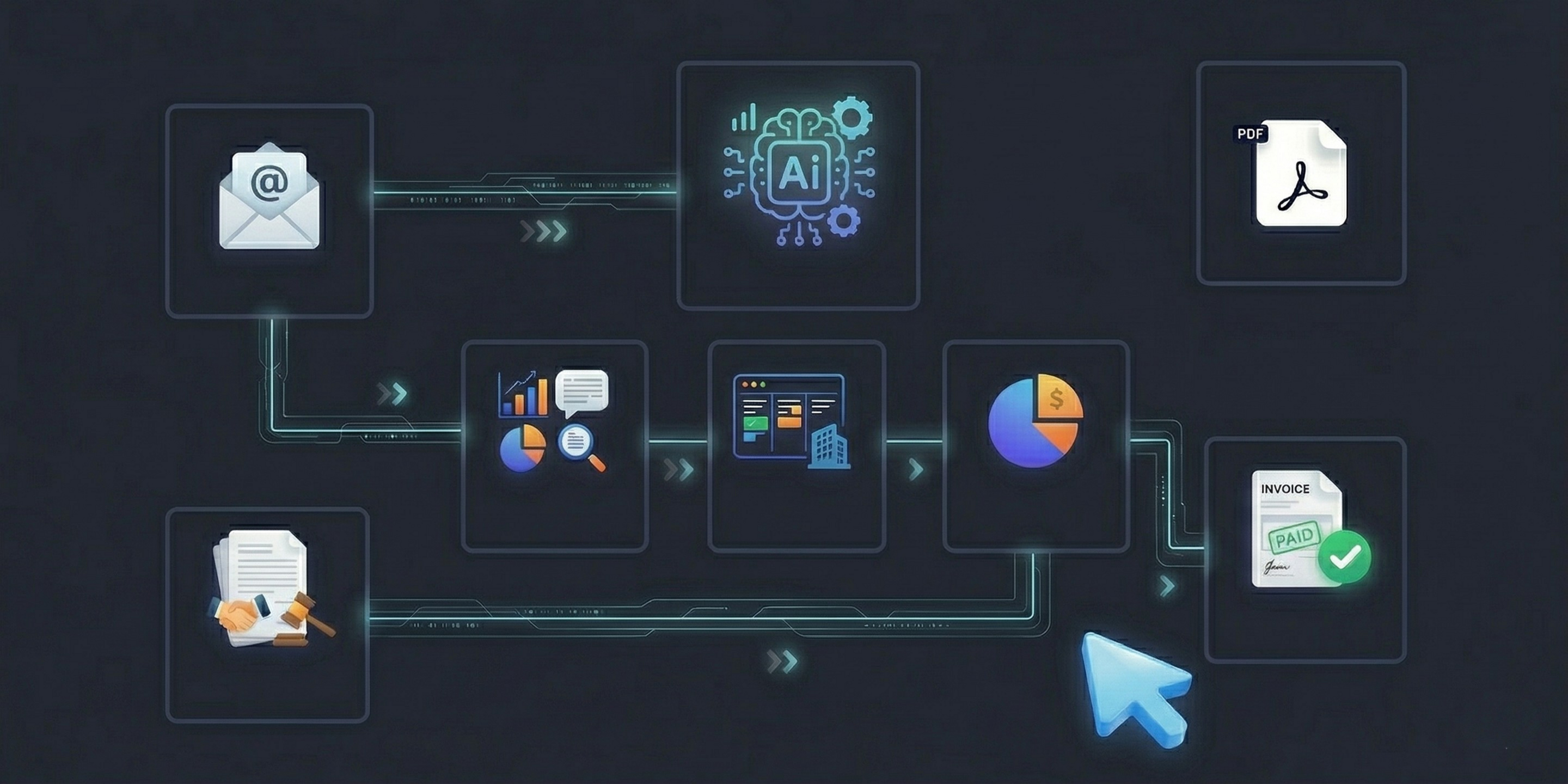
Because the page is the easy part. The hard parts are everything it connects to: form logic that routes sponsors differently from attendees, calendar invites that survive Outlook and Apple Mail, confirmation emails that reach the inbox instead of spam, GDPR-clean data flow, CRM sync, post-event reporting. None of that is a weekend project. The bar in 2026 is no longer "we have a page." It is "the page is one piece of a properly connected attendee experience." AI does not yet ship that in a box, and the platforms that do are the ones still worth paying for.
With that out of the way, on to what makes one of these websites actually convert.
What the data says
Research consistently shows that events convert well when the page is built around intent. Visitors arrive wanting to register, not browse. They have a date in mind, they are assessing whether the event is worth their time, and they will leave the moment the process feels slow or confusing.
A few findings from CRO research (primarily Unbounce, HubSpot, and Baymard Institute) that hold up across event registration contexts:
Form length is the biggest lever. Shorter forms consistently complete at higher rates. The research does not agree on exact percentages across contexts, but the direction is clear and consistent: every required field past four or five carries a real cost. Move anything that is not essential to a post-registration follow-up.
Single-CTA pages outperform multi-CTA pages. Pages with one primary action in the hero convert better than pages that ask the visitor to also watch a trailer, download an agenda, or follow a social profile. Pick one action and commit to it.
Multi-step forms tend to outperform single-page forms at equivalent field counts, particularly for longer flows. A progress indicator after a short first step (name and email) raises the psychological cost of abandonment.
Mobile conversion lags desktop on registration forms more than on most other page types. Single-column layout, large tap targets, and browser autofill enabled close most of the gap. If you have not tested the form on your phone before launching, you have not tested it.
Inline validation consistently improves completion. Showing field-level feedback on blur (rather than only at submit) reduces abandonment at the form step. It is one of the cheapest improvements available.
These are directional principles, not magic numbers. The exact lift you will see depends on your event, your audience, and your baseline. But the direction is reliable. Build around them.
What's different about event websites in 2026
A few shifts worth knowing before you start:
Single-CTA pages have pulled further ahead. The gap between single-CTA and multi-CTA landing pages has widened as more events compete for the same attention. One action per screen.
Multi-step registration is now expected, not clever. Attendees who register for events regularly have been conditioned to expect a short first step. A single long form feels behind.
Mobile-first is no longer optional. Mobile now represents the majority of first-touch traffic for most B2B event registration funnels. The registration experience on a phone is the registration experience.
Post-registration sequence matters as much as the page. Registrant-to-attendee conversion is where show rates are won or lost. The website is step one, not the whole job.
Hold those four shifts in mind. They shape what a good event website should actually do.
Before you start: why this only takes 30 minutes
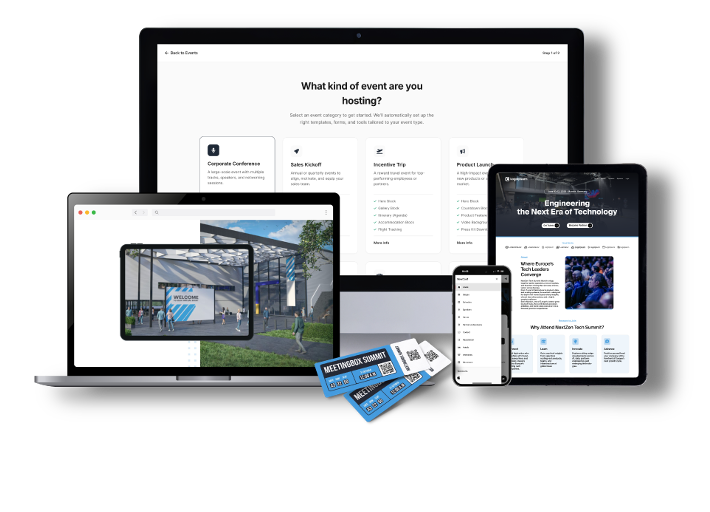
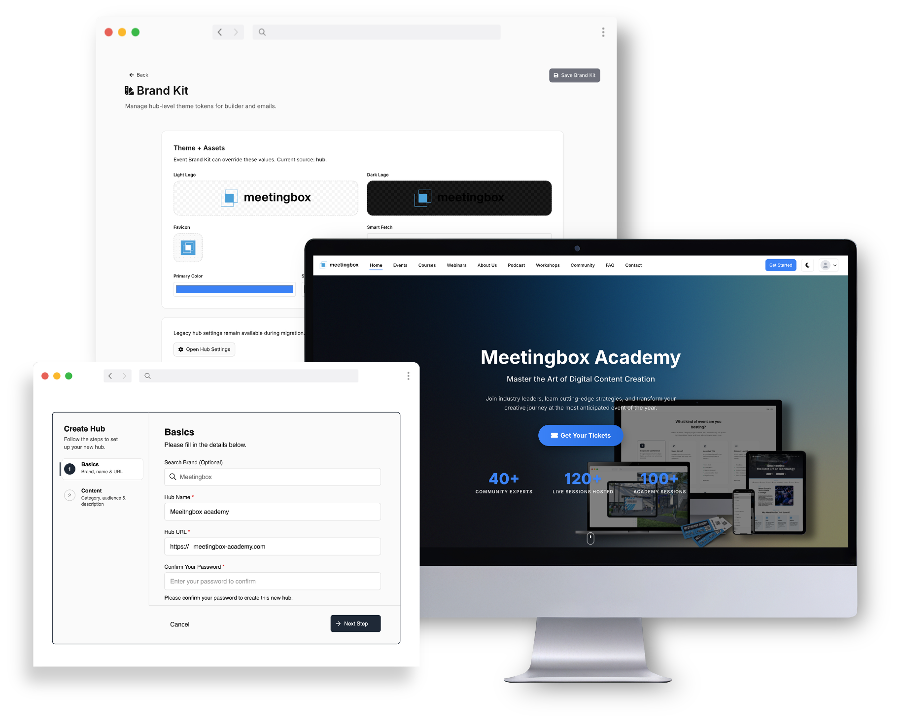
One thing worth flagging before you open the website builder. The setup wizard you complete when you create the event, the one that asks for your event name, dates, location, format, and a short description, has already done more than you might think. In Meetingbox Live, that setup flow feeds directly into the website builder, and the blocks it pre-populates are not random. They map onto the five questions a good event page has to answer: what is this event, when and where, what will happen, why attend, how to register.
So when you open the builder, the hero block already has your event name and tagline. The when and where block has your dates and venue. The agenda block is structured and waiting for sessions. The registration block is wired to the form. You are not staring at a generic template with lorem ipsum placeholders that you have to manually swap out with the same information you typed ten minutes ago. The structure is there, the context is there, and the blocks are already organised around the order visitors will read them.
The other thing worth flagging is mobile. You are building one website, not a desktop version that you then have to separately optimise for phones. Meetingbox Live renders the same build responsively across screen sizes, which matters because for most B2B event registration funnels, the first visit is on mobile. You get that for free without doing anything extra.
Together, these two things are most of the reason a 30-minute build is realistic. You skip the manual content entry, you skip the mobile rebuild, and you start the actual work with momentum.
The 5-step build
Step 1: Start from a template, not a blank page (3 minutes)
Blank canvas tools cost time you do not have. The structural sections of a high-performing event website are well-established: hero, what / when / where, agenda, speakers, social proof, FAQ, registration. The job of the page is to answer the visitor's questions in the order they ask them.
Meetingbox Live ships with templates structured around event types: sales kick-offs, conferences, roadshows, product launches, internal summits. The structure is set. You replace placeholder content with your event's content.

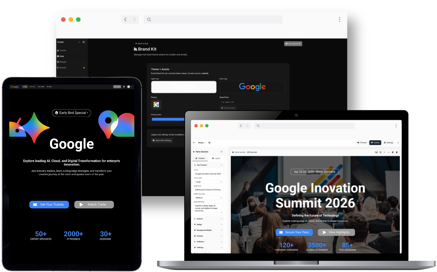
Step 2: Apply the brand once (5 minutes)
In Meetingbox Live, brand setup is centralised. Logo, primary and secondary colours, heading and body fonts, configured once at the event level. Every page on the event site, every email, every form picks up the brand automatically.
The reason to do this once, properly, instead of styling each section as you go: consistency across touchpoints (registration page, confirmation email, reminder, attendee dashboard) is what reads as "professional." A hero that looks great while the confirmation email is platform-default is a common giveaway that a stitched-together stack is in use.
Set the brand once. Site, forms, and emails inherit it automatically.
Step 3: Write only what answers the five questions (10 minutes)
Most event websites have too many words. The job of the page is to answer five questions in under ten seconds:
- What is this event
- When and where
- What will happen (agenda, speakers)
- Why attend (the value proposition, social proof)
- How to register
Concrete content rules:
Hero: one headline, one sub-headline, one CTA. Resist the temptation to add a secondary "Watch the video" button next to the primary "Register" button.
Speaker bios under 60 words. Lead with the achievement that matters for this event, not the full LinkedIn summary.
Agenda: specific session titles beat clever ones. "How we cut event production time by 40 percent" outperforms "The Future of Events." Visitors are scanning to decide if it is worth their time.
FAQ is not decoration. It is the 24/7 assistant that answers parking, dietary, cancellation, and dress-code questions before they hit your inbox.
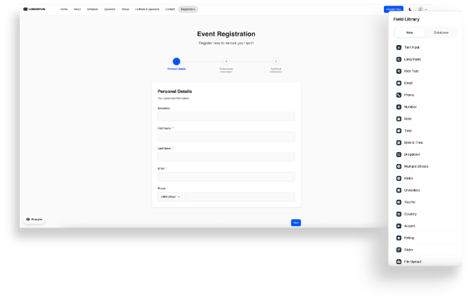
Step 4: Build the registration form, ruthlessly (5 minutes)
This is where most events lose the most attendees.
Five required fields, maximum. Name, email, company, job title, ticket type. That covers what you actually need. Everything else (dietary, accessibility, t-shirt size, session preference) goes in a post-registration email or behind conditional logic.
Use conditional logic for audience-specific fields. In-person attendees see the dietary field. Virtual attendees do not. Sponsors see the sponsor agreement. The form gets shorter for everyone individually, even if there are more possible fields in total.
Consider splitting into two steps. Step one: name and email. Step two: everything else. The progress bar after step one is doing real psychological work.
Inline validation, not submit-time validation. Show "email looks valid" or "this field is required" on field blur, not on submit. Worth a meaningful lift in completion rate depending on form length.
Single column on mobile, large tap targets, autofill enabled. This closes most of the mobile-vs-desktop gap on lead-gen forms.
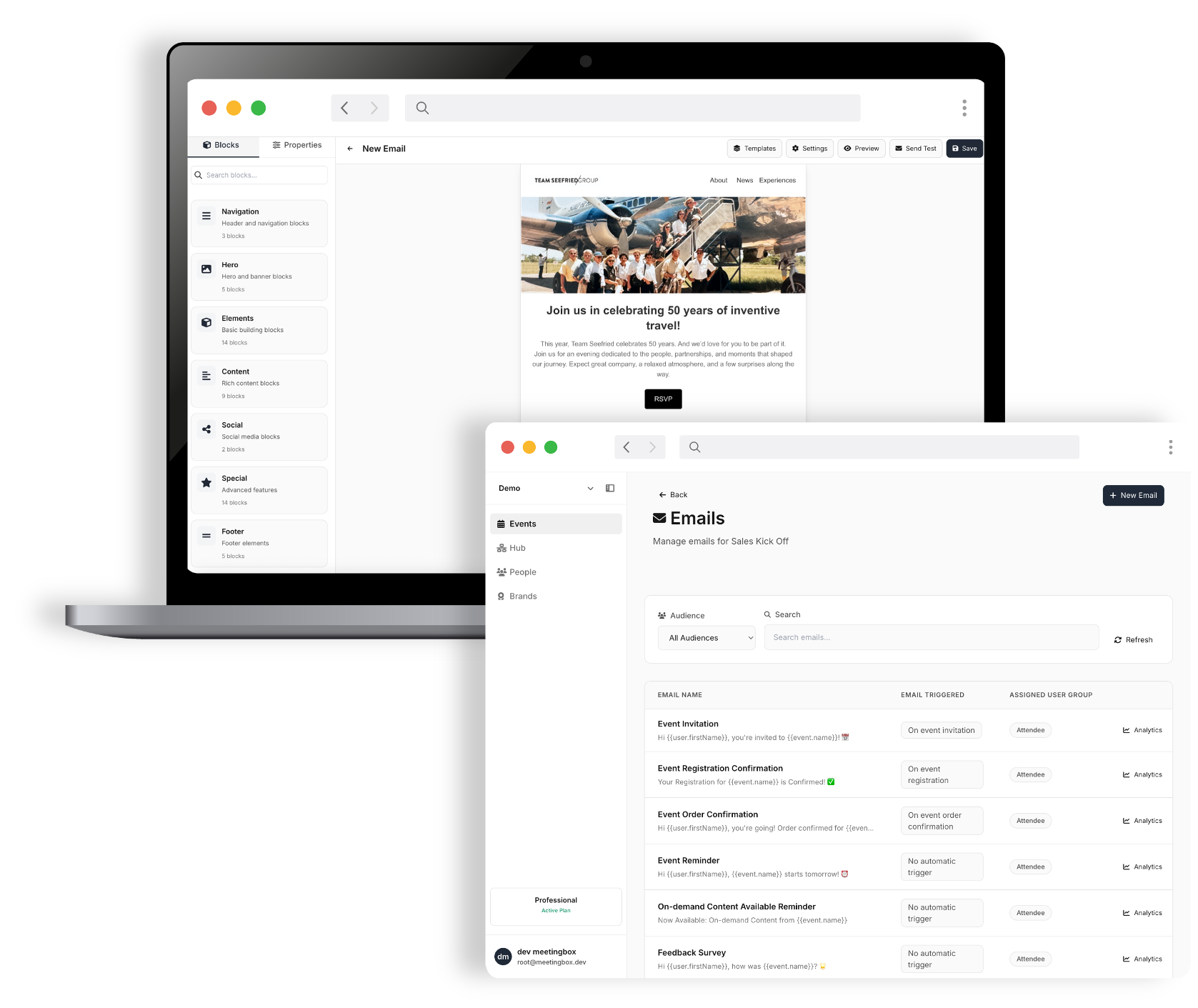
In Meetingbox Live, the form builder supports conditional logic and step-based forms natively. Submissions flow into the attendee list for that event. No CSV exports, no Zapier glue.
Step 5: Custom domain and publish (3 minutes)
Self-hosted-feeling URLs (events.theircompany.com) outperform platform-default URLs on trust signals, and they preserve brand on social shares.
Add the custom domain in Meetingbox Live settings. Update the DNS CNAME record (usually a 5-minute job, the only part that might involve someone technical). Publish.
Total elapsed time, if focused: around 30 minutes for a standard event. Multi-track conferences with complex agendas take longer because the content takes longer to write, not because the platform is slower.
Don't forget the part that happens after they register
The page is not the whole job. Registrant-to-attendee conversion is where show rates are won or lost, and the touches that move that number are not on the website. They are in the inbox.
The non-negotiable touches for a B2B event in 2026:
Instant confirmation email with calendar invite (.ics attachment, not just a link)
Reminder 7 days out (re-confirms logistics, builds anticipation)
Reminder day-of or day-before (location, parking, what to bring)
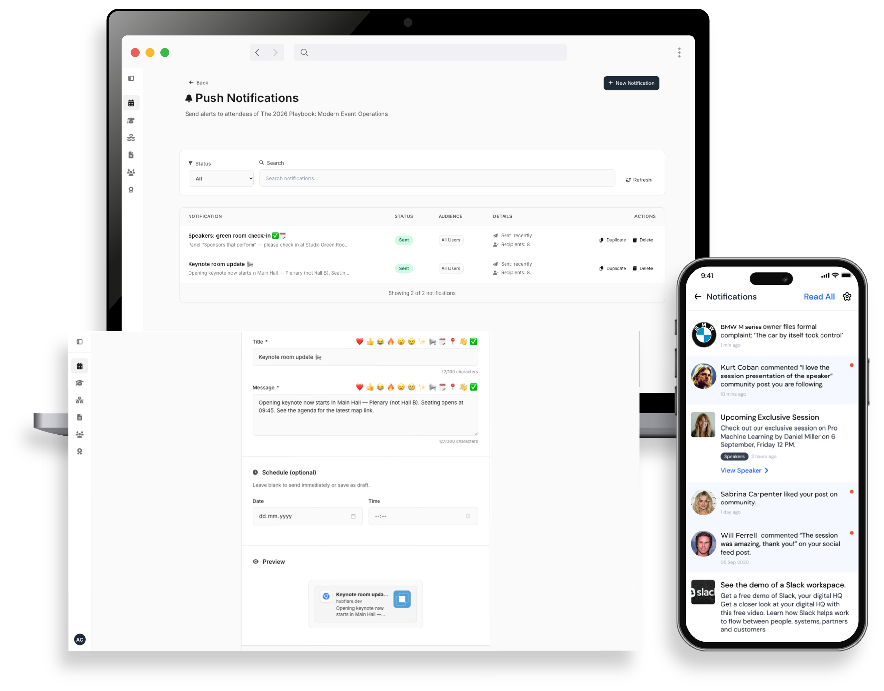
For higher-value events, adding SMS as a secondary channel for the day-of reminder consistently outperforms email-only sequences. SMS open rates are an order of magnitude higher than email, and the day-of reminder is the one that matters most.
In Meetingbox Live, these are configured as part of the event setup, and they inherit the brand from Step 2. Write the copy once per event, set the schedule, done.
But make sure you avoid these mistakes
Patterns that consistently kill conversion:
"More information coming soon" on the homepage. People do not come back to check. If details are not ready, delay launch.
PDFs instead of website content. Every download is a chance for the visitor to leave and not return. Key information lives on the page.
Required fields that should be optional. Move dietary, accessibility, and t-shirt size to a post-registration email.
Confirmation emails that do not match the brand. The biggest tell that a stitched stack is in use. Trust drops.
No mobile testing. Mobile traffic is now the majority share for most B2B event registration funnels. If you have not opened the page on a phone, you have not tested it.
A note on choosing the platform
The structural choices covered above are non-negotiable regardless of what you build on. But the platform sets the ceiling on what those choices can actually do. Conditional logic that breaks on mobile, confirmation emails that skip the inbox, branding that only carries to the registration page and stops, these are platform problems, not content problems. Getting the form right matters. Building it on a platform that executes it reliably matters just as much.
Platforms differ on a few axes that compound at scale:
Pricing model. Some platforms charge per registration, others per event, others per seat on the team. None is universally better. Per-event pricing is predictable and rewards you for filling the room, but it can get expensive if you have not stress-tested it against your actual event mix (how many events a year, what size, paid or free). Worth doing the maths on a full year of your portfolio before committing, not on a single event.
Branding control. Some platforms allow deep customisation of every touchpoint. Others constrain you to platform-default styling on emails or registration forms.
Bundled vs stitched. Bundled platforms (website + registration + emails + attendee app in one tool) eliminate the integration tax. Stitched stacks (one tool for the website, another for registration, another for email) cost time and create data sync problems.
Meetingbox Live is bundled and built for full branding control across every attendee touchpoint, on a per-event pricing model. Optimised for teams running multiple events a year where setup speed and brand consistency compound across events.
One last thing worth keeping in mind: a well-built event site is rarely a one-off. The same setup can be reused as on-demand content after the live event ends, rolled into a portfolio of recurring events, or extended into adjacent formats like podcasts, learning hubs, or certification programmes when the audience is there for it. The work you put in on day one keeps paying back if you build with that in mind.
Meetingbox Live is the event website, registration, and attendee experience module of the Meetingbox platform. Built for agencies and corporate event teams running multiple events a year. Book a demo to see your next event built in 30 minutes.